AARON
LIMBU

PetCare

How might we help owners of pets with medical issues purchase food easily?

Timeline

Aug 2021 - Nov 2021

Role

UX and UI design

Tools

Figma, Miro

Project overview

PetCare focuses on allowing users to buy special food products (recommended by veterinary doctors) on a subscription basis, for pets with health or medical issues.

What problem are we solving?

Visiting the veterinary clinic to buy special food on a regular basis is not financially sustainable for owners of pets with medical or health issues and a strain on their monthly budget.

Solution!

Design an app that allows users to easily buy special pet food certified by veterinary doctors.

01 — User and Competitive Research

Understanding the user

Assumptions:
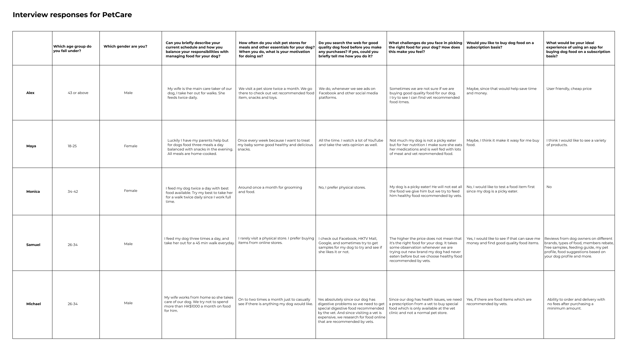
A)
Visits to a veterinarian’s clinic for follow-ups to purchase special pet food is not financially friendly and time consuming
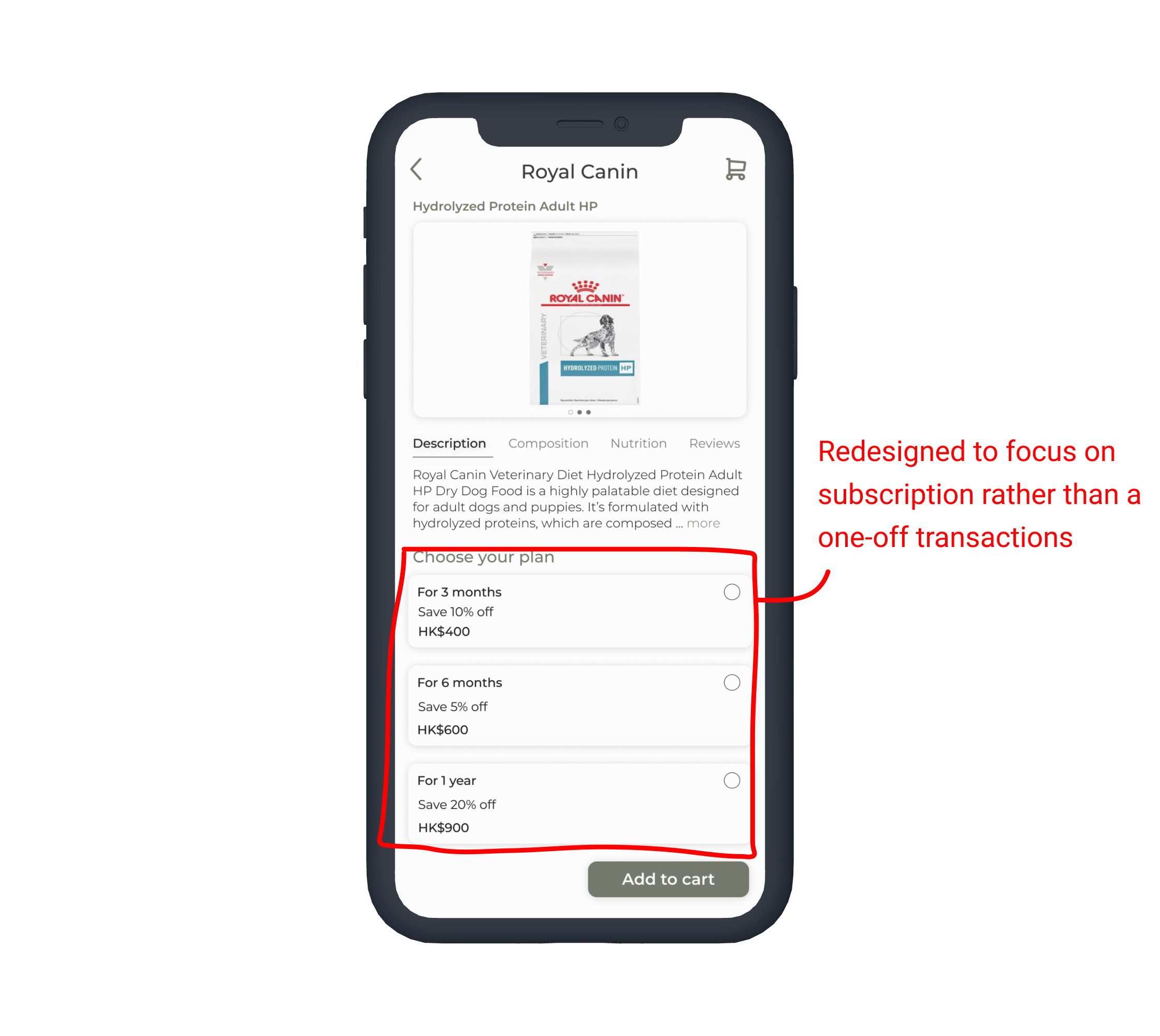
B)
Owners of pets with medical issues would prefer food on a subscription basis

Summary: Before diving in head first it was important that I conduct interviews and create empathy maps to understand the users I’m designing for and their needs.
A primary user group identified through research was working adults who owned pets with medical or health issues.
The research confirmed my assumptions that visiting a veterinarian’s clinic for follow-ups to purchase special pet food was time consuming and put a strain on users’ financial budget set aside for their pet.

Frustrations from users:

Persona

Based on my research, I recognised two key user type that my product tried to solve problems for. I decided to focus on one persona since their need was bigger and we could have a greater impact and fun trying to solve their problem.
Problem statement:
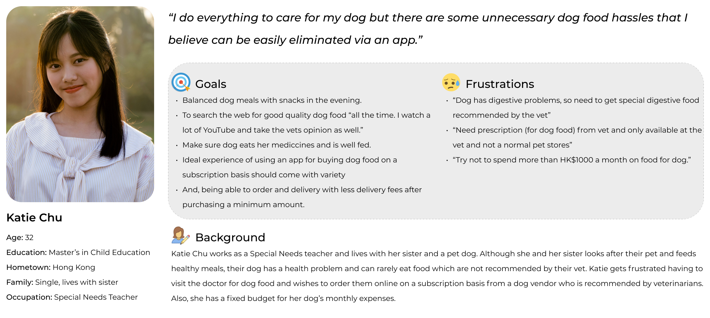
Katie Chu is a Special Needs teacher who needs an online pet food vendor who sells special dog food approved by veterinarians for her dog with digestive problems because visiting the vet’s clinic every time she has to buy special food is not financially helpful and a strain on her monthly budget set aside for her dog.
Click to open

User journey map

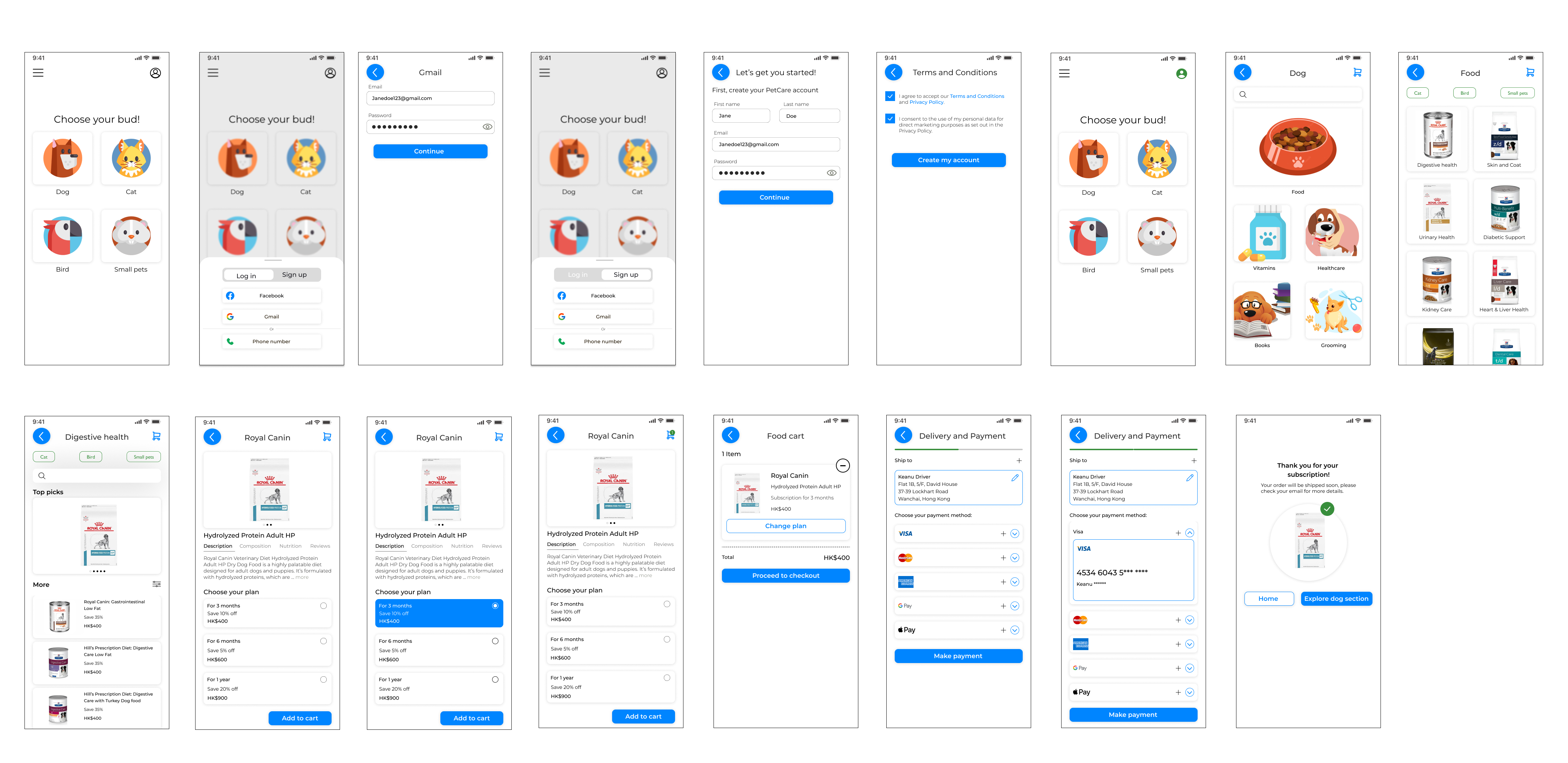
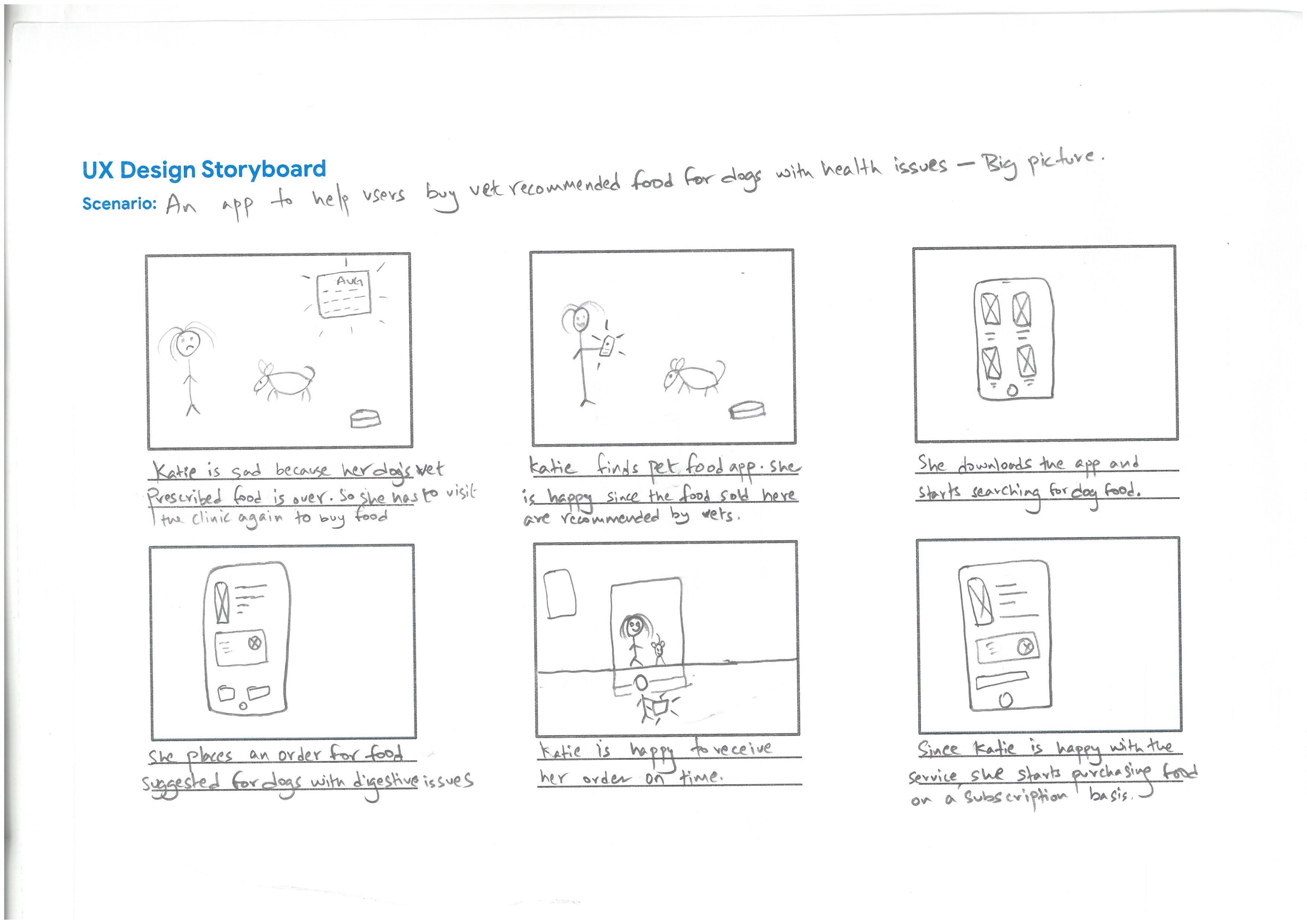
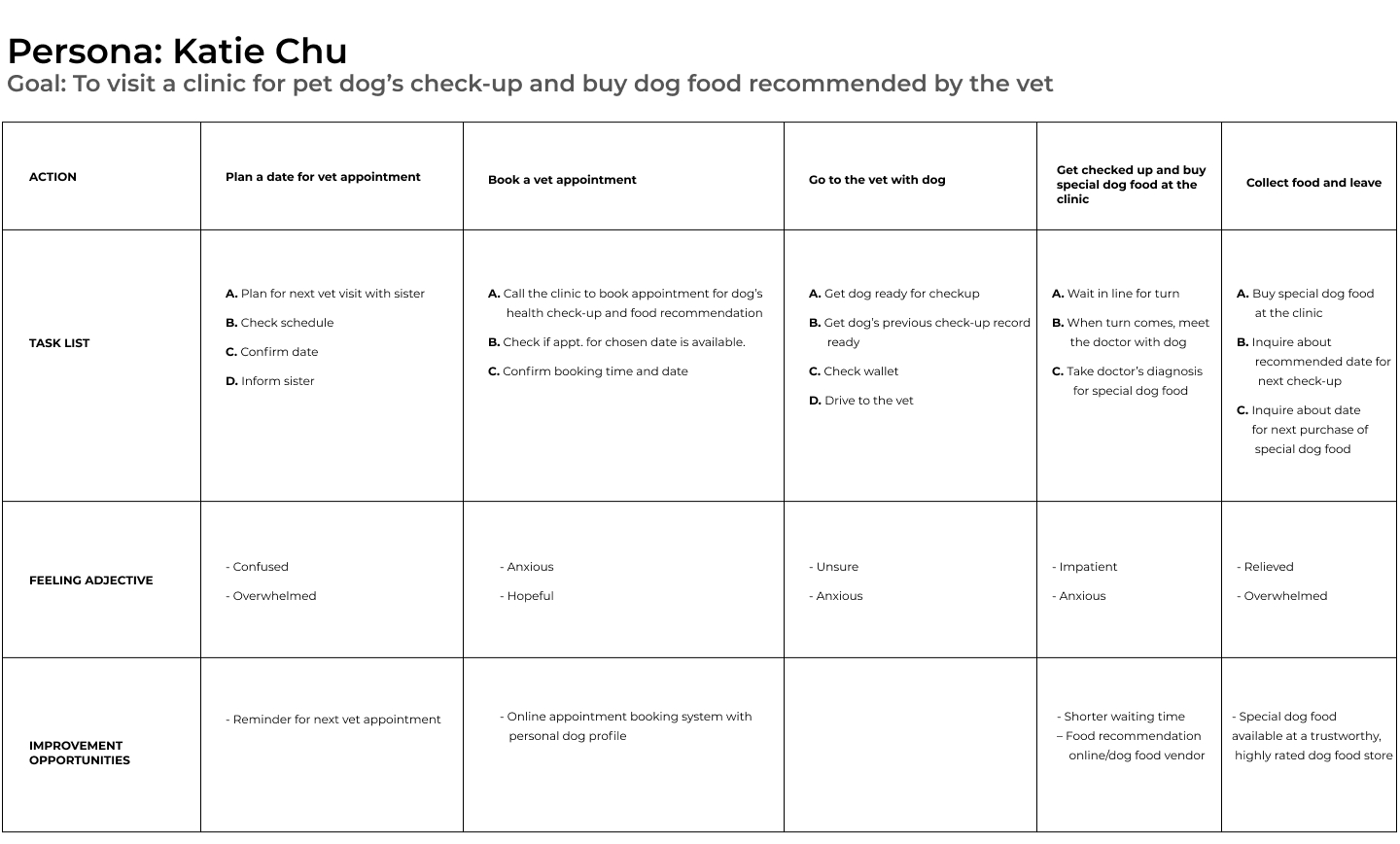
Before proceeding into the design phase, mapping Katie’s user journey revealed how helpful it would be for users to have access to a dedicated app that supplies special food for owners of pets with health or medical issues.
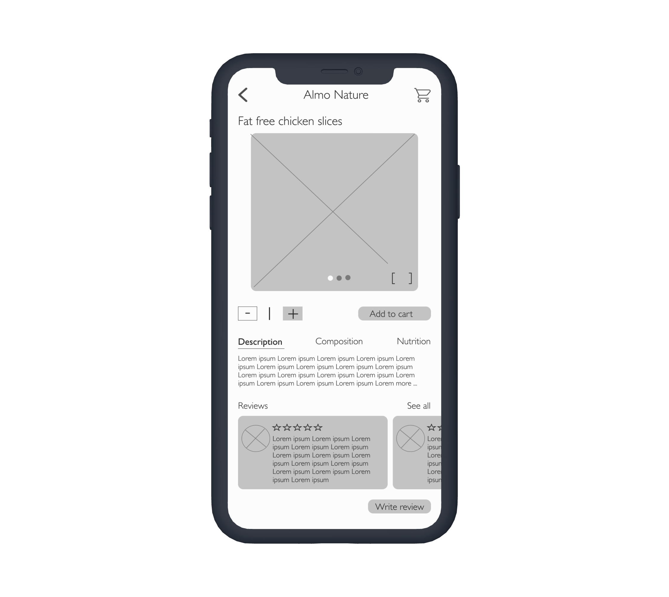
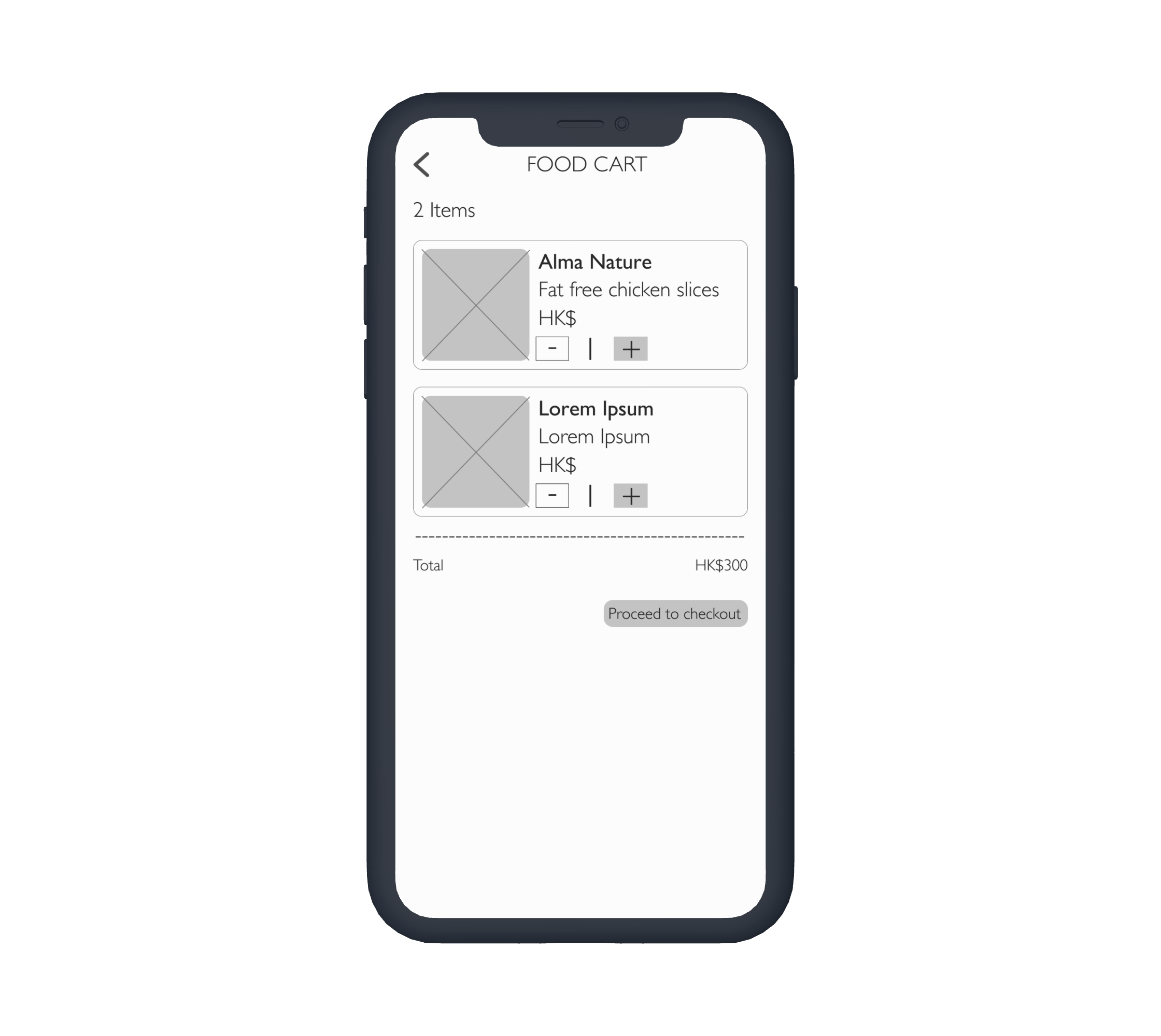
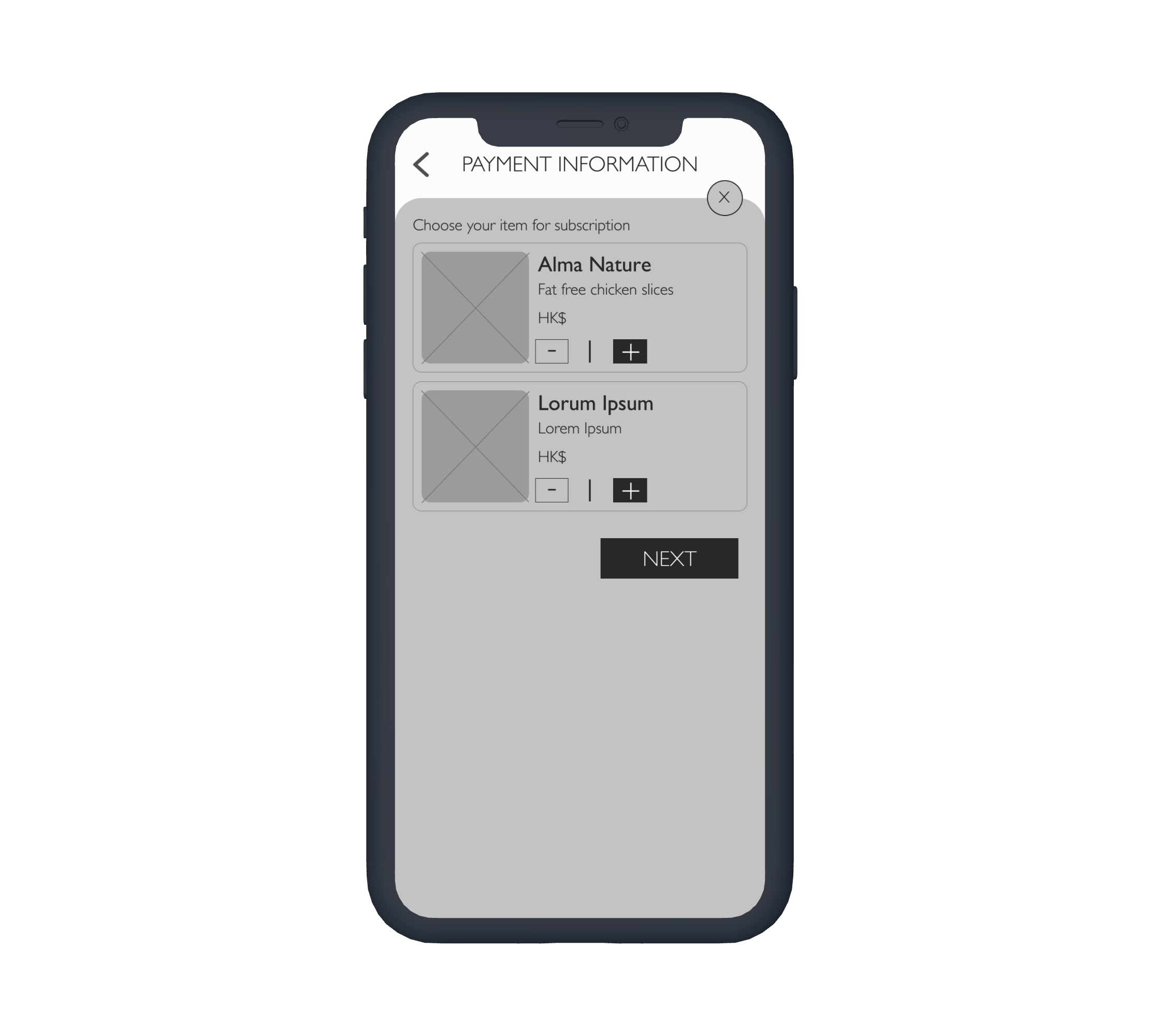
Competitive audit and report

Following user research, I conducted a competitive research to evaluate websites and apps of vendors selling dog food and other pet products in Hong Kong to get an understanding of their strengths and weaknesses relative to their own business, product, and design. Below are the links to my research.
FINDINGS:
- No recommendation by vets
- No subscription
- Limited products for pets with medical issues

02 — CONCEPTUALIZE

Storyboarding & paper wireframes 

After completing the research process, I proceeded into the design phase with the data that I had collected. Prior to creating wireframes I constructed storyboards to visually predict and explores a user's experience with the product. It also helped in understanding the user flow within the product, providing a clear sense of what's really important for users.

03 — DESIGN PHASE

Digital wireframes

- Due to personal biases during the initial design phase, I came across multiple hurdles. As a result, I deviated from the user goal of ordering food on a subscription basis.
-
After careful iteration, my second design decision helped me figure out the problems with my designs. I figured that I was getting closer to the desired screens based on user feedback and goals.
-
Ultimately, before deciding on digital wdireframe version 3, I conducted a small usability test on low-fidelity prototype 1 (next sub-heading) I built based on version 2.

Low-fidelity prototype

Taking guidance from the digital wireframes, I also created two different versions of low-fidelity prototypes. In this process I discovered that designing a product is not linear and changes or iterations are inevitable.
Using the completed set of digital wireframes version 3, I created a low-fidelity prototype based on it. The primary user flow allowed users to select a food item with a subscription option in the later phase of the user flow before the check out process so that the prototype could be used in a usability study.
View the PetCare app: Low-fidelity prototype

Usability study

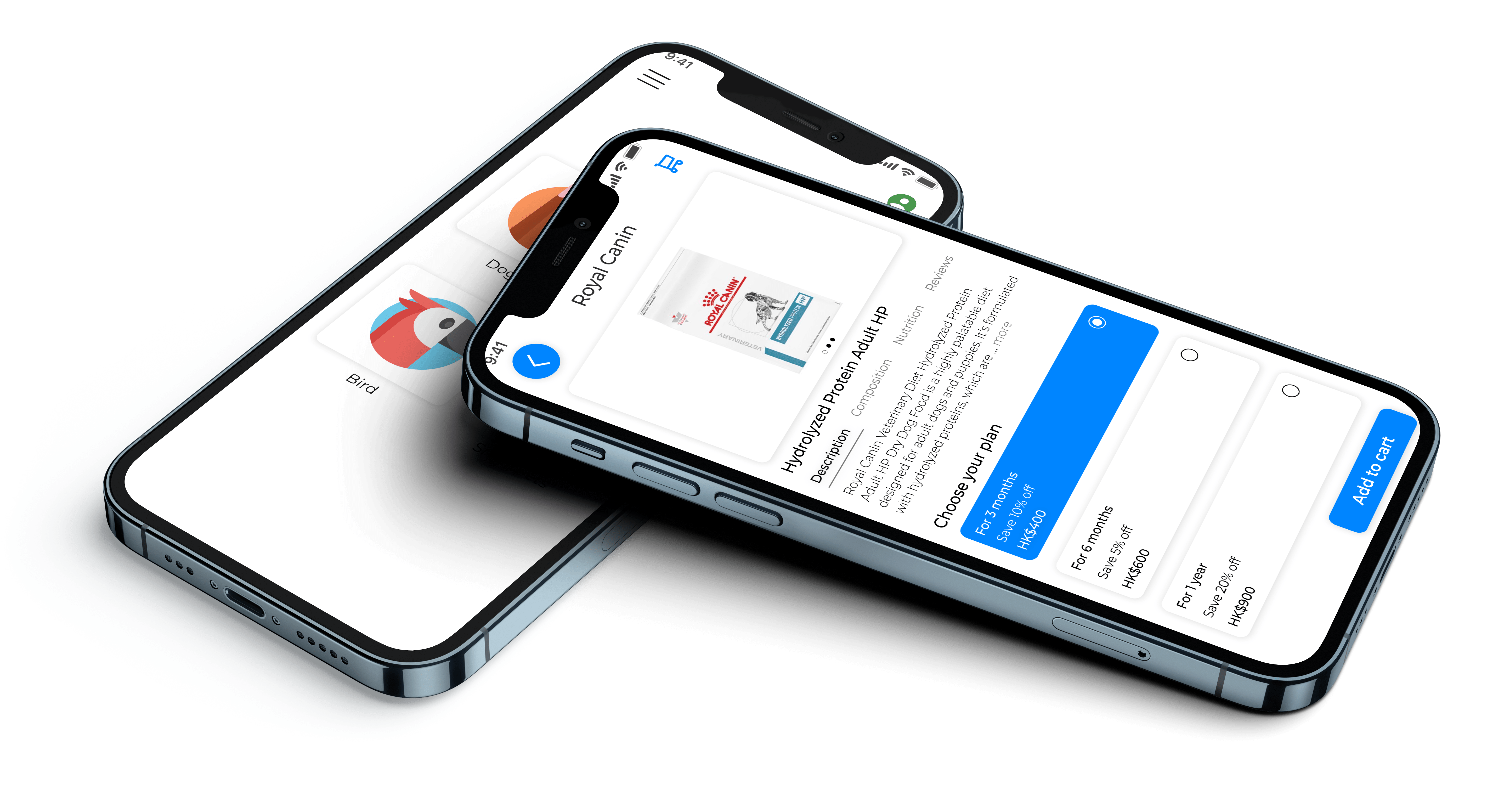
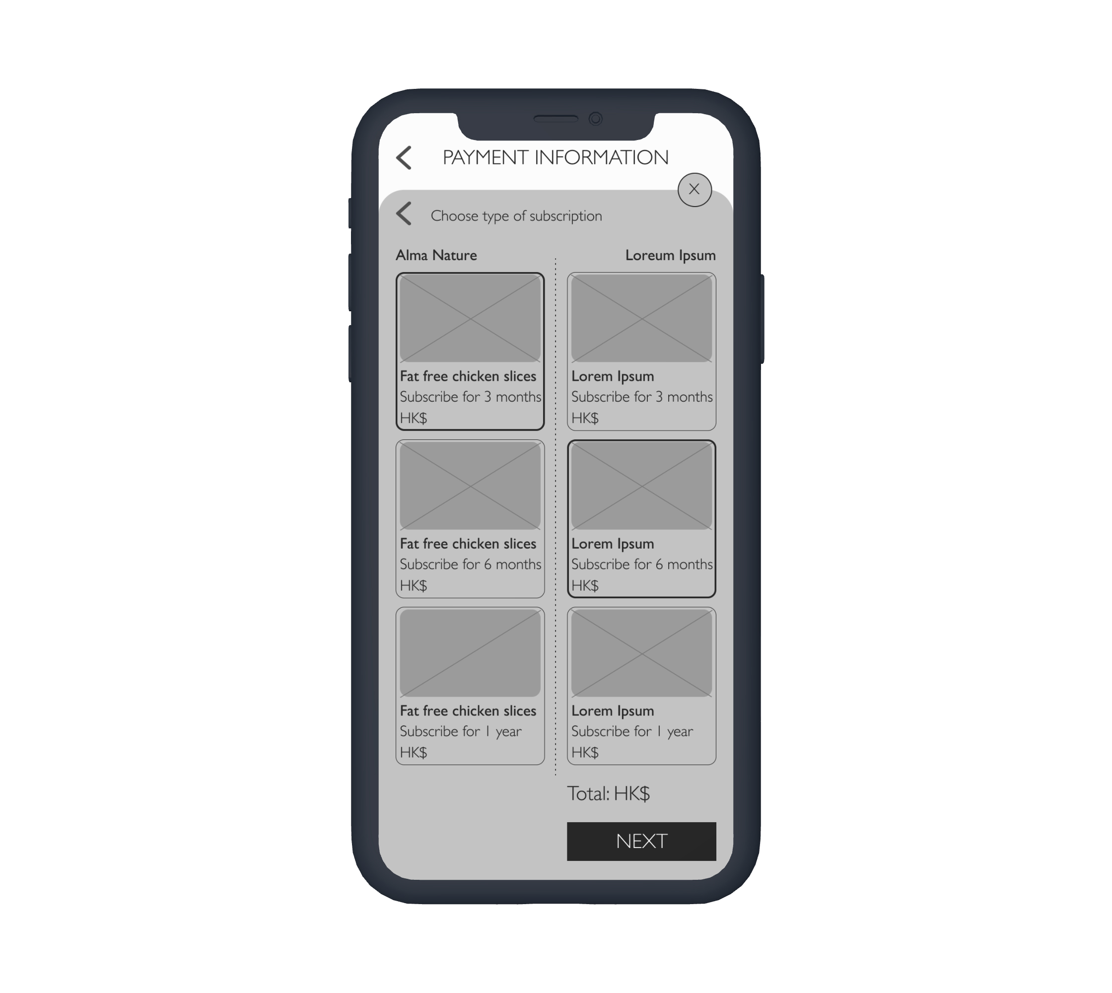
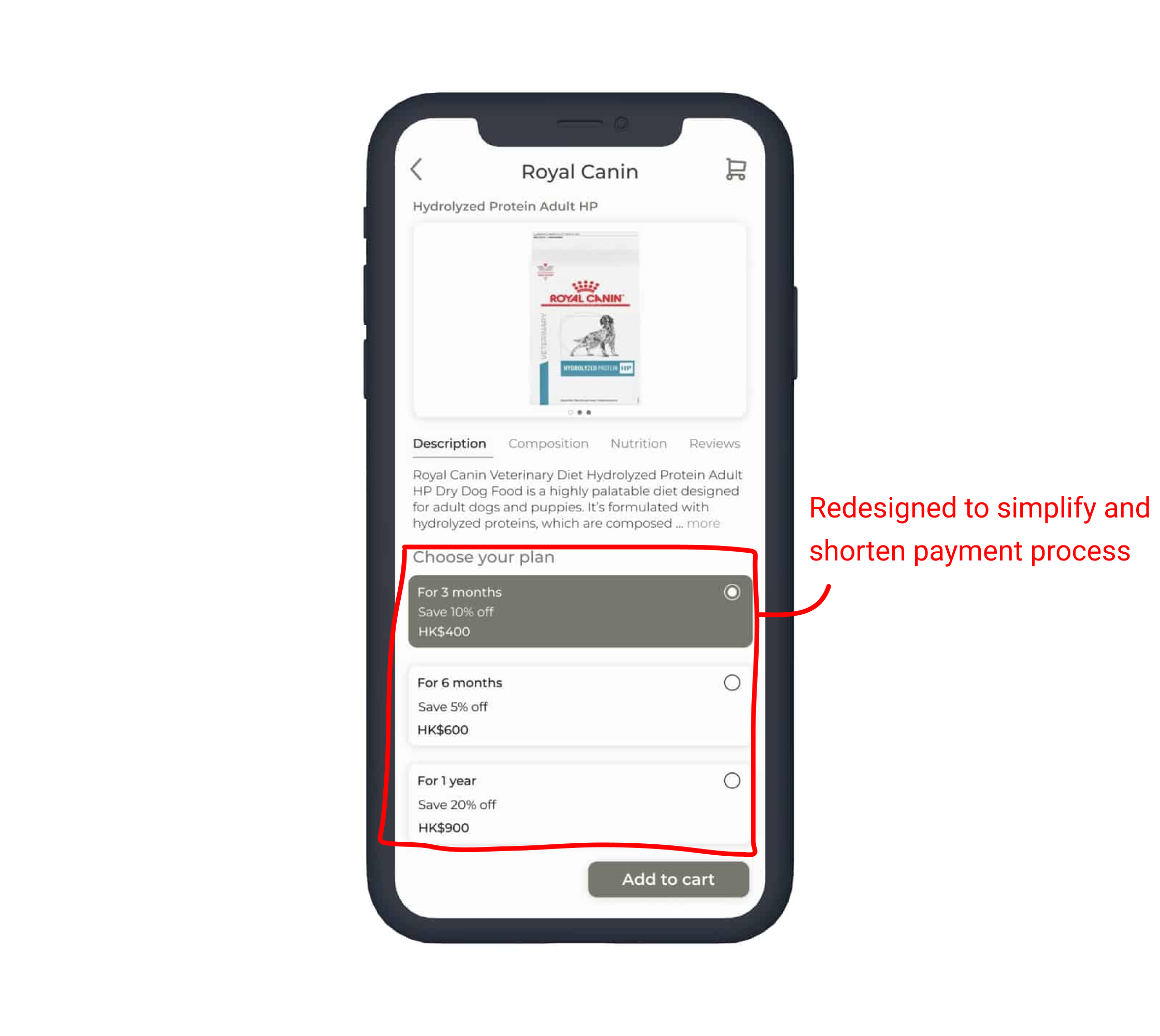
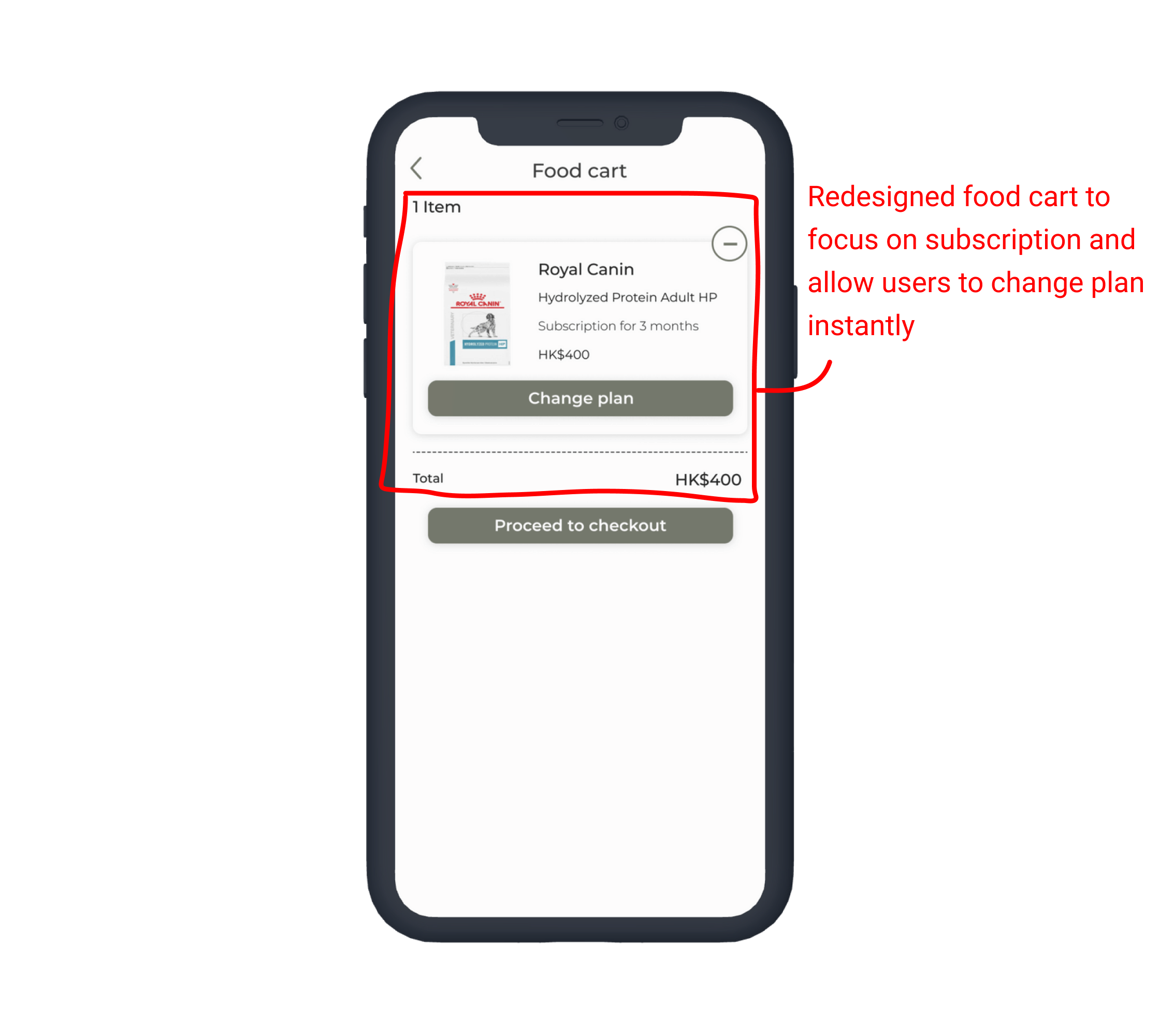
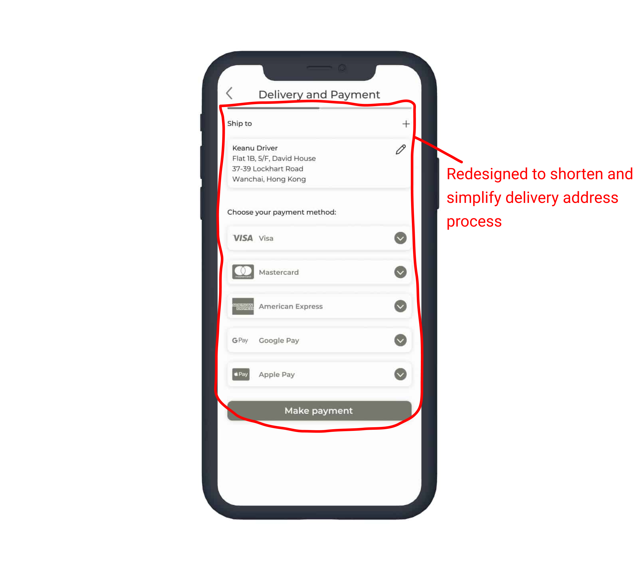
I conducted two rounds of usability studies. Findings from the first usability study helped guide the designs from wireframes to mockups. The second usability study was done using a high-fidelity prototype which revealed what aspects of the mockups needed refining.

ROUND 1 FINDINGS
  • Users were confused and found the food subscription process tedious to complete
  • The design should focus on subscriptions rather than a one-off transactions of pet food
  • Users took longer than expected time to complete the checkout process
  • Some users took more time than expected to locate the log in/sign up option while some were confused while completing the log in/sign up process.
ROUND 2 FINDINGS
  • Along with the subscription option, users would want to see a 'trial option' for selected food items since pet owners might not be sure if their pet would like the food or not.
  • Introducing a top navigation section on the sub category page will help users switch through contents between types of pets. For example, on the dog page, a user can tap on the navigation bar to switch between cat, dog or small pets.

04 — Refining the design

Mockups

Early designs allowed for customisation and flexibility to explore different ways to solve the user problem. But the usability study showed that the overall layout and the user goal were still not satisfactory. Therefore, after receiving feedback, I re-designed the layout and paid attention to the design's primary goal: to allow users to purchase food items on a subscription basis instead of a one-off basis. Also, I moved the subscription option a step earlier than the previous version in the over user flow.
Click to open
The usability study also revealed another set of failures: the payment process frustrated users. Feedbacks showed that users wanted a more easy, direct or less cluttered design for the overall user flow.
Click to open

High-fidelity prototype

The final high-fidelity prototype presented cleaner user flows for selecting and subscribing to a special food item. It also simplified the checkout and payment process.
View the PetCare app: High-fidelity prototype

Design system & Accessibility considerations

Creating a design system allowed to me ensure a consistent user interface across my design and also, I was able to quickly design the prototype from mid to high within a short period of time.
While focusing on accessibility helped me understand users who are usually ignored while designing a product.
In terms of Accessibility:
- HEADINGS: I provided access to users who are vision impaired through adding alt text to images for screen readers.
- LANDMARKS: I used landmarks such as icons to help make navigation easier.
- ALT TEXTS: I designed the site with alt text available on each page for smooth screen reader access

05 — Going forward

Takeaways

Click to open

Next steps

Creating this product and understanding the various process involved was an extremely steep learning curve. It was an eye-opening experience that taught me a lot about being lean and knowing when and where to focus your energy and efforts.
Moving forward:
- Conduct another round of usability studies to validate whether the pain points users experienced have been effectively addressed.
- Conduct more user research to determine new areas of need.
- Conduct more research to explore new accessible features for users with disabilities.
AaronLimbu2021