Case Study
Building a design guideline for Chain Valley
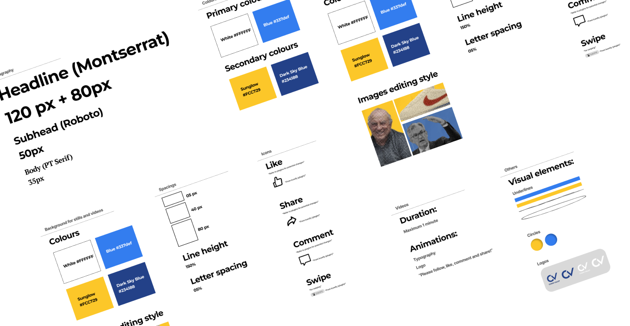
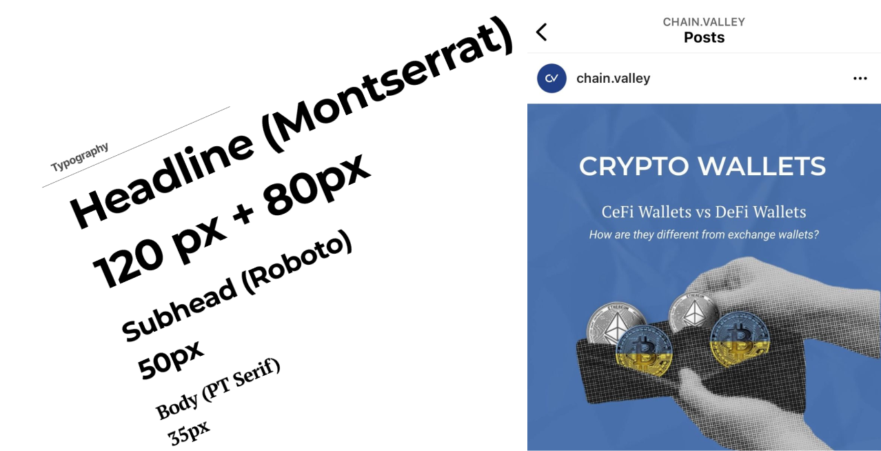
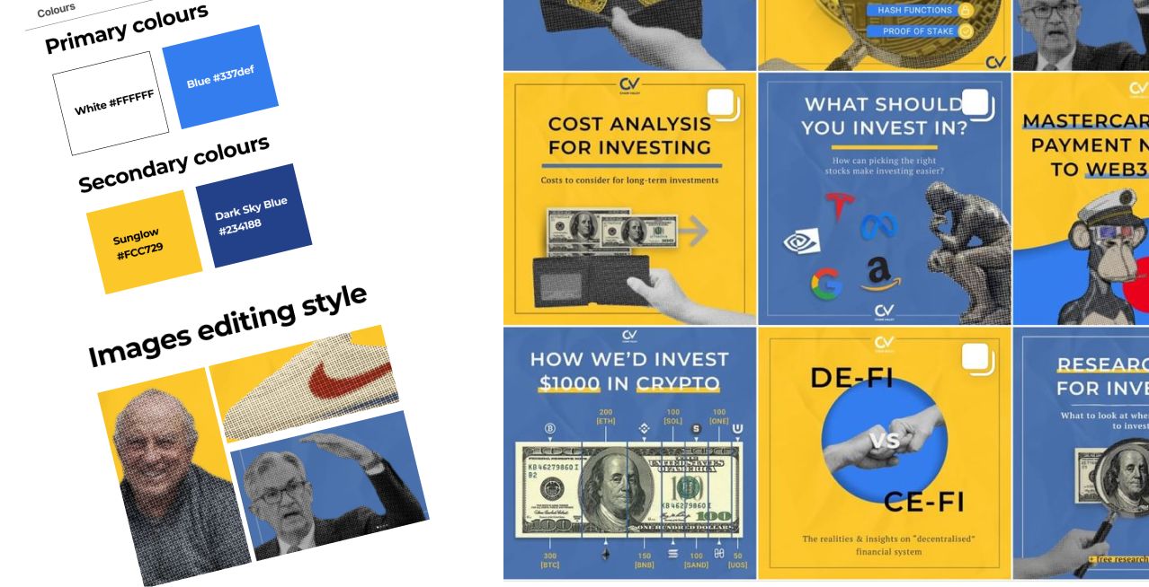
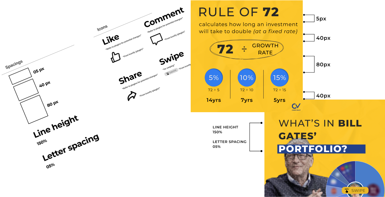
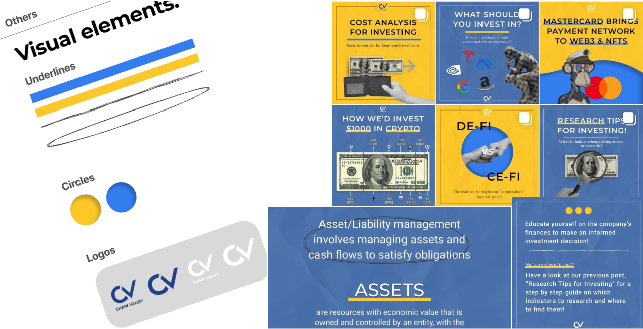
When I first onboarded into Chain Valley, the company lacked a design guideline. This motivated me to come up with a system that would help the company design content with consistent visual appeal, which eventually gave the company its own unique aura or brand image.

Why did Chain Valley require a design guideline?
Prior to building a design guideline, Chain Valley had inconsistent visual appeal. We wanted to build visual consistency to help weave a consistent narrative that could resonate deeply with our followers. It would also later help users identify Chain Valley’s content at first glance.

Before