Redesigning EyeCare 20-20-20
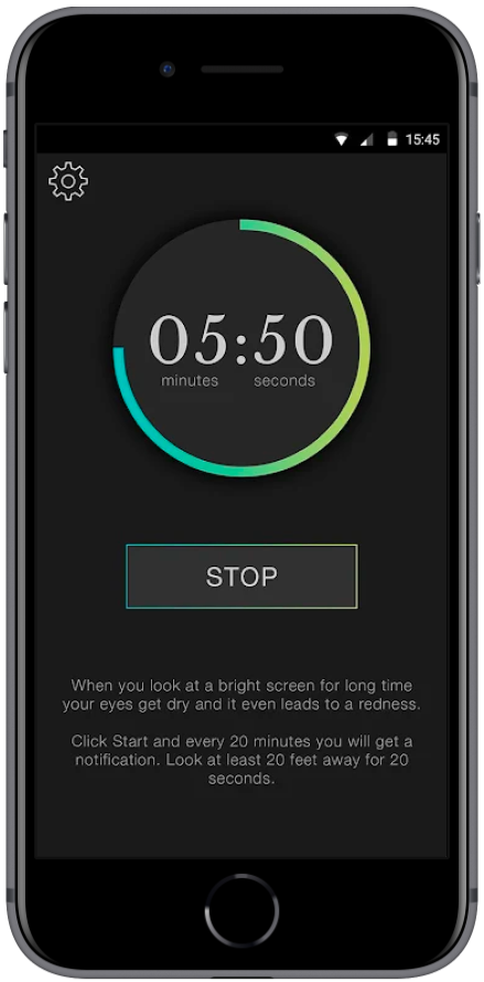
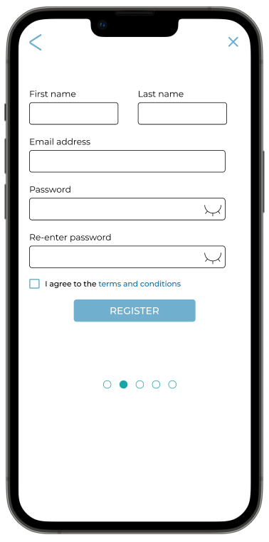
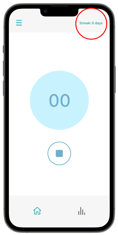
Before
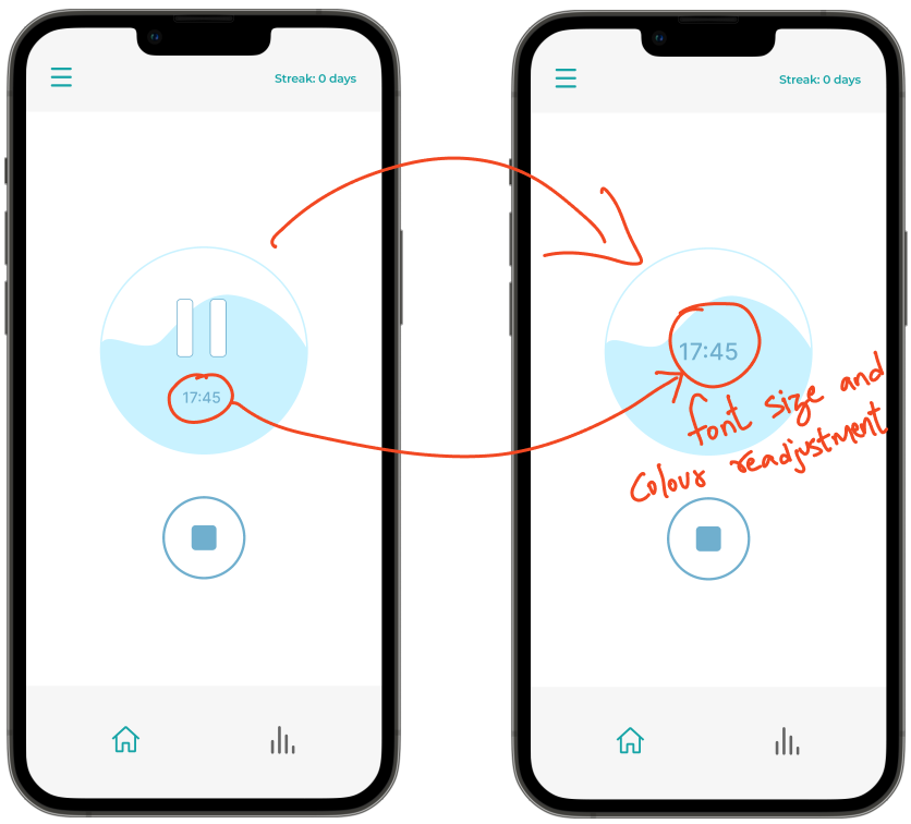
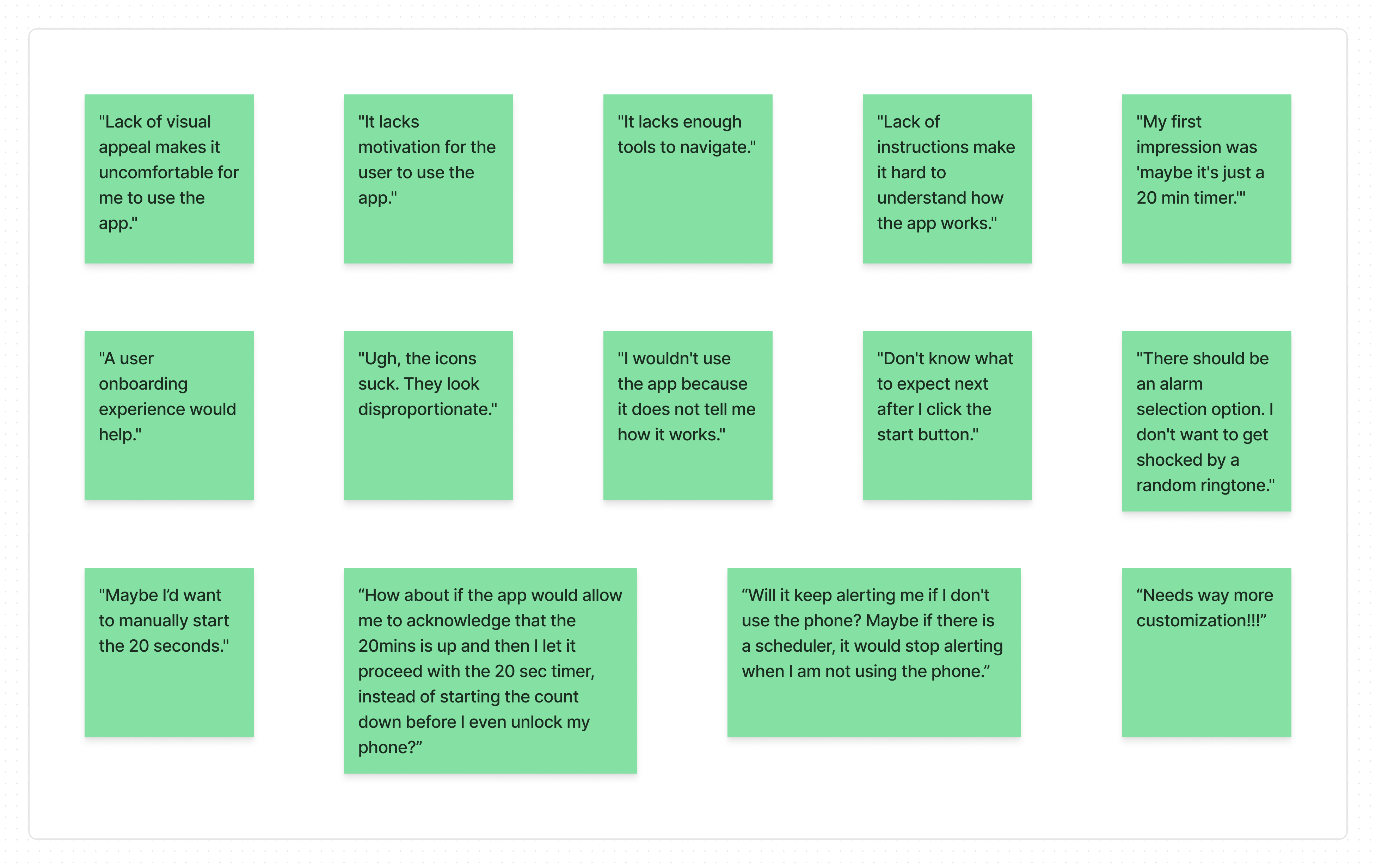
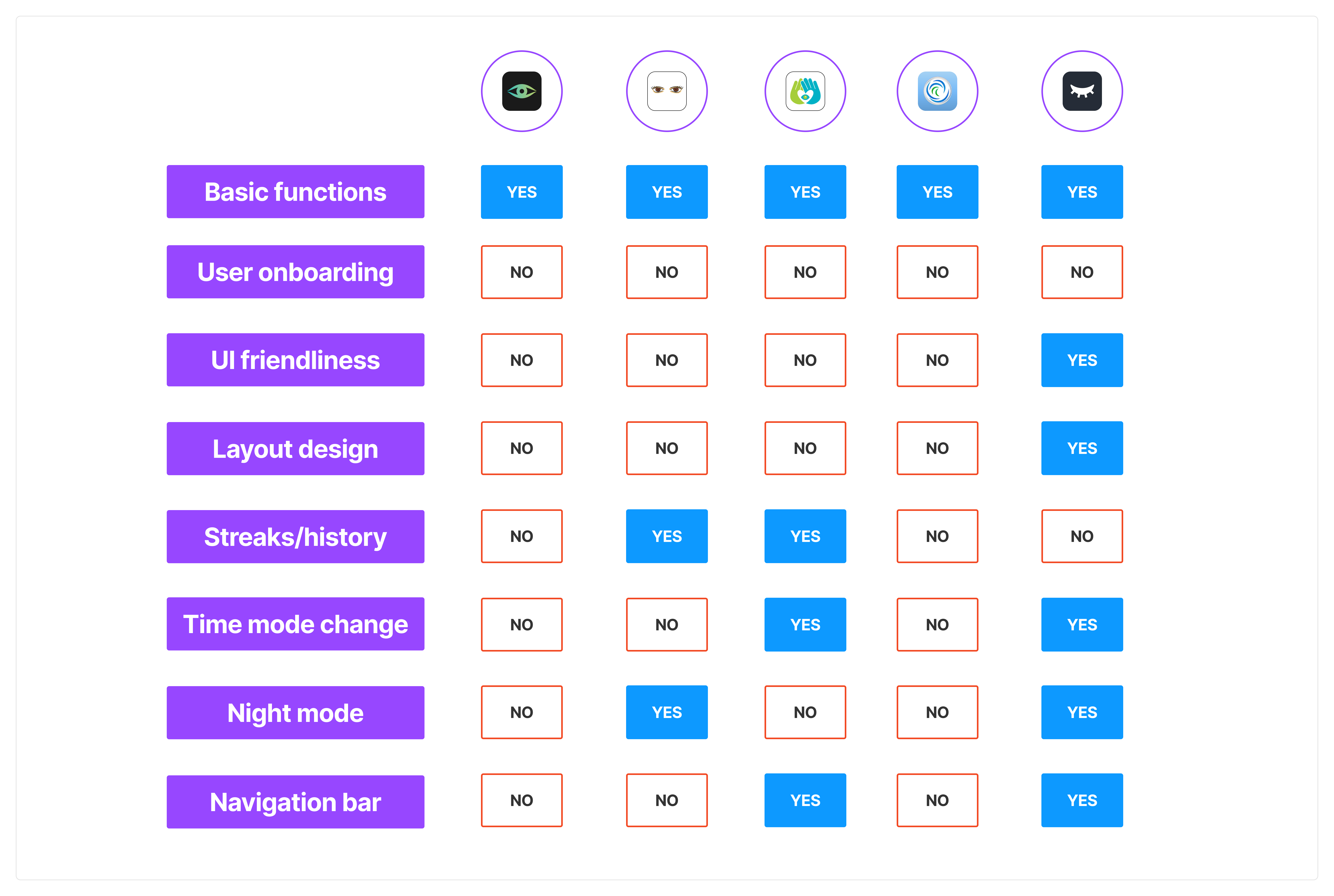
The problem
After using this app for a while, I discovered:
Lack of:
- user control in the product,
- motivation to use the app,
- an inclusive design appeal
- user control in the product,
- motivation to use the app,
- an inclusive design appeal
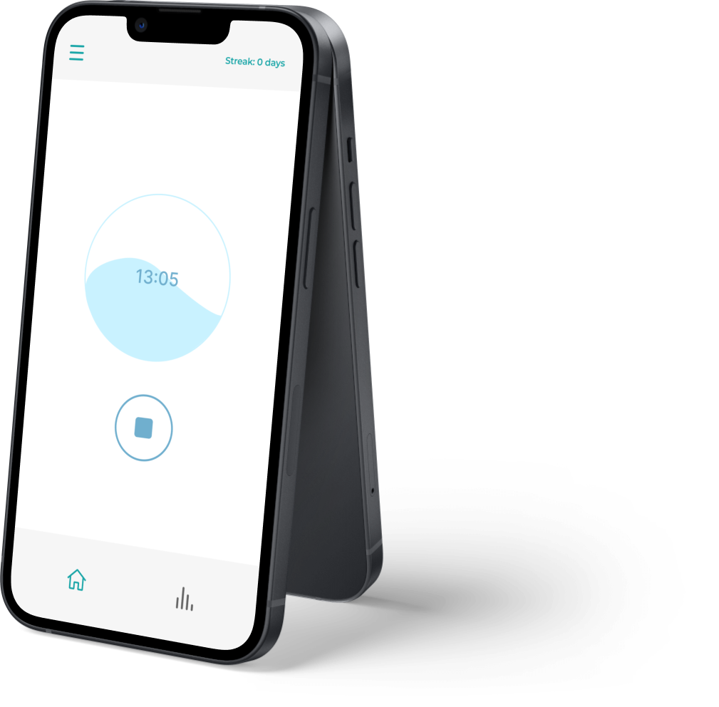
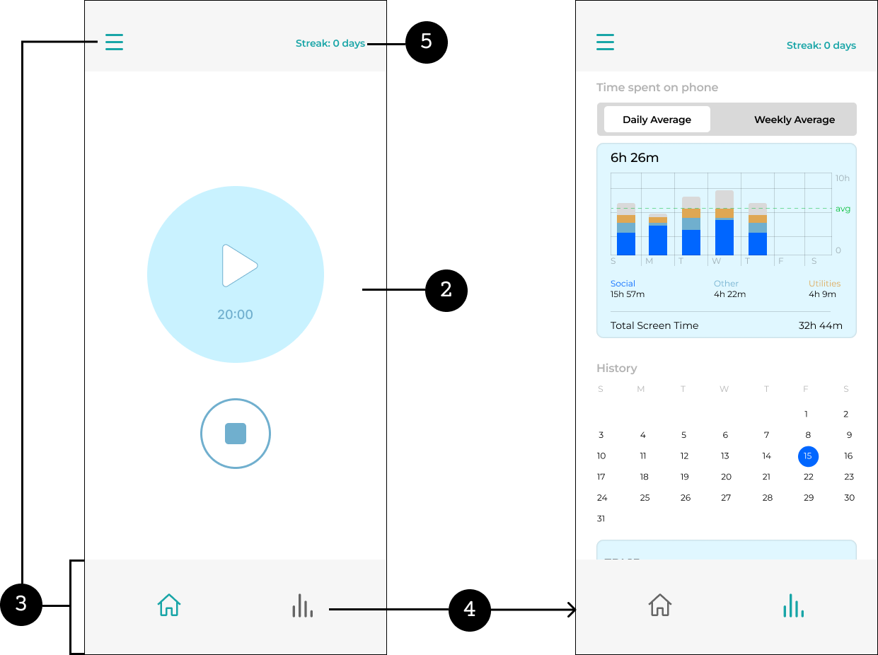
After
What is EyeCare 20-20-20?
An app that reminds users to take a break from their digital screens every 20 minutes and look at something 20 feet away for 20 seconds.


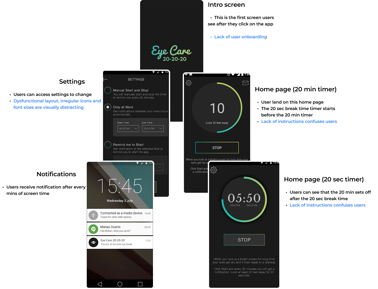


.gif)
.gif)