Improving user onboarding for OpenRice
OpenRice is a food and restaurant guide. The Hong Kong app and website has approximately 40,000 recorded restaurants, 530,000 registered diners and over 572,000 ratings and comments.
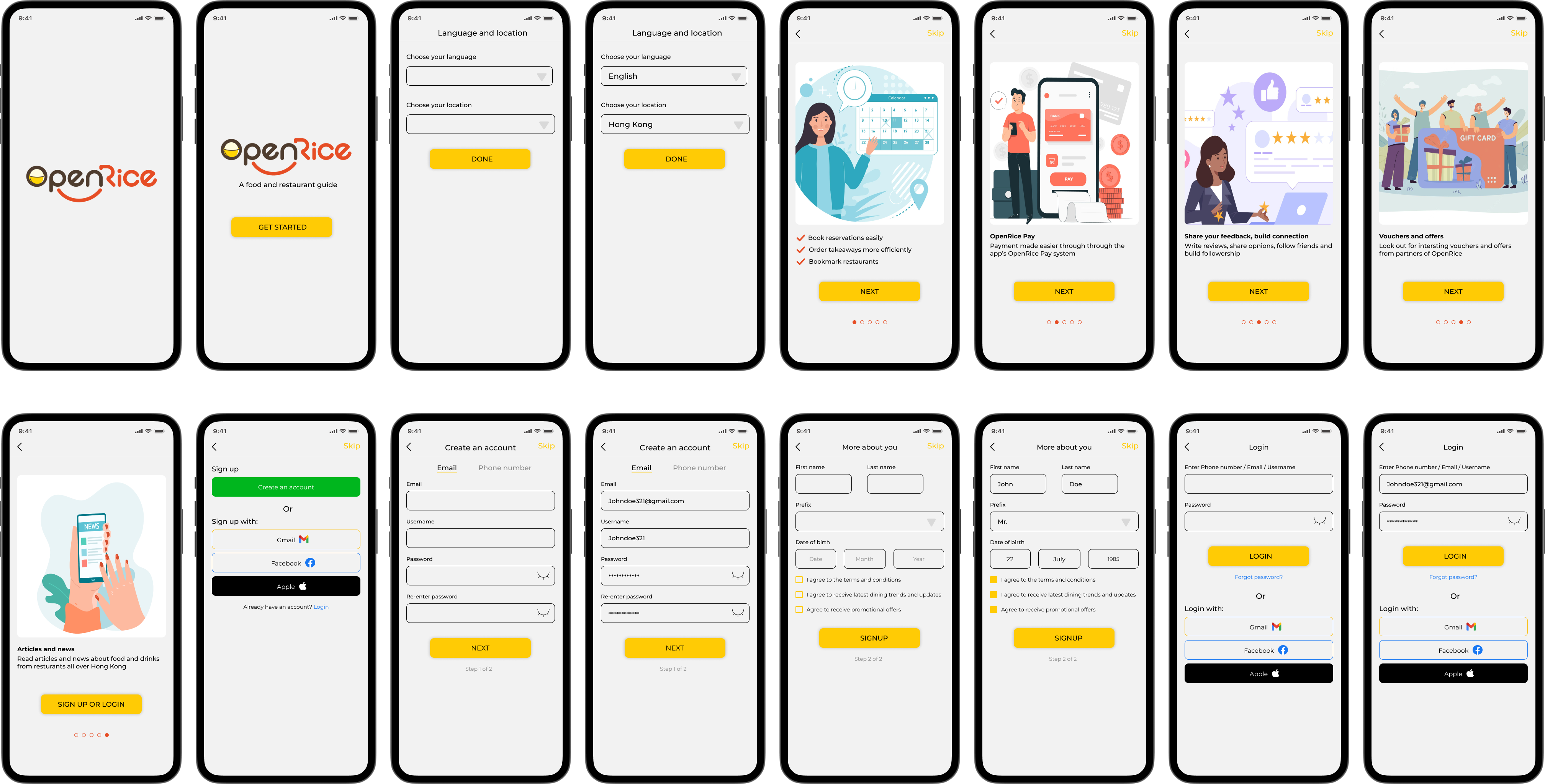
This case study shows the process I have taken to improve the user onboarding metrics for OpenRice.
Role
UX/UI designer
Tools
Figma
Notion
Part 1
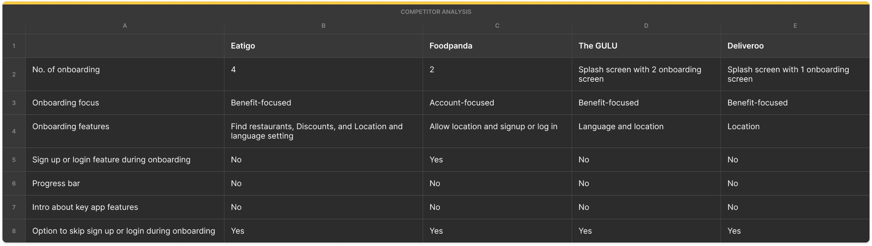
Heuristics
App UX heuristics
- Helpful if the onboarding process reminds users why they want to use the OpenRice app
- Lacks in informing users what the app has to offer
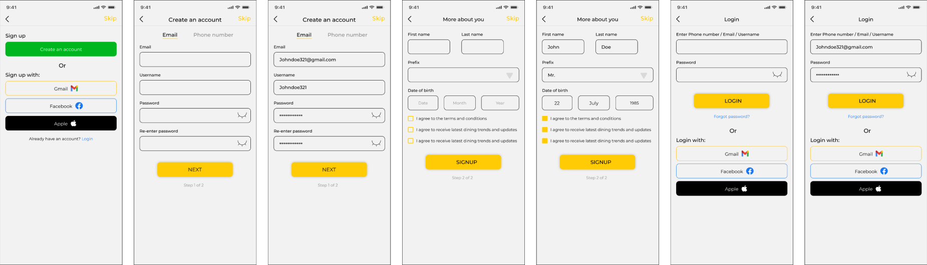
- The "create an account" process is tedious, with several steps to complete
- Lacks progress indicators
- The signup and login page looks congested"
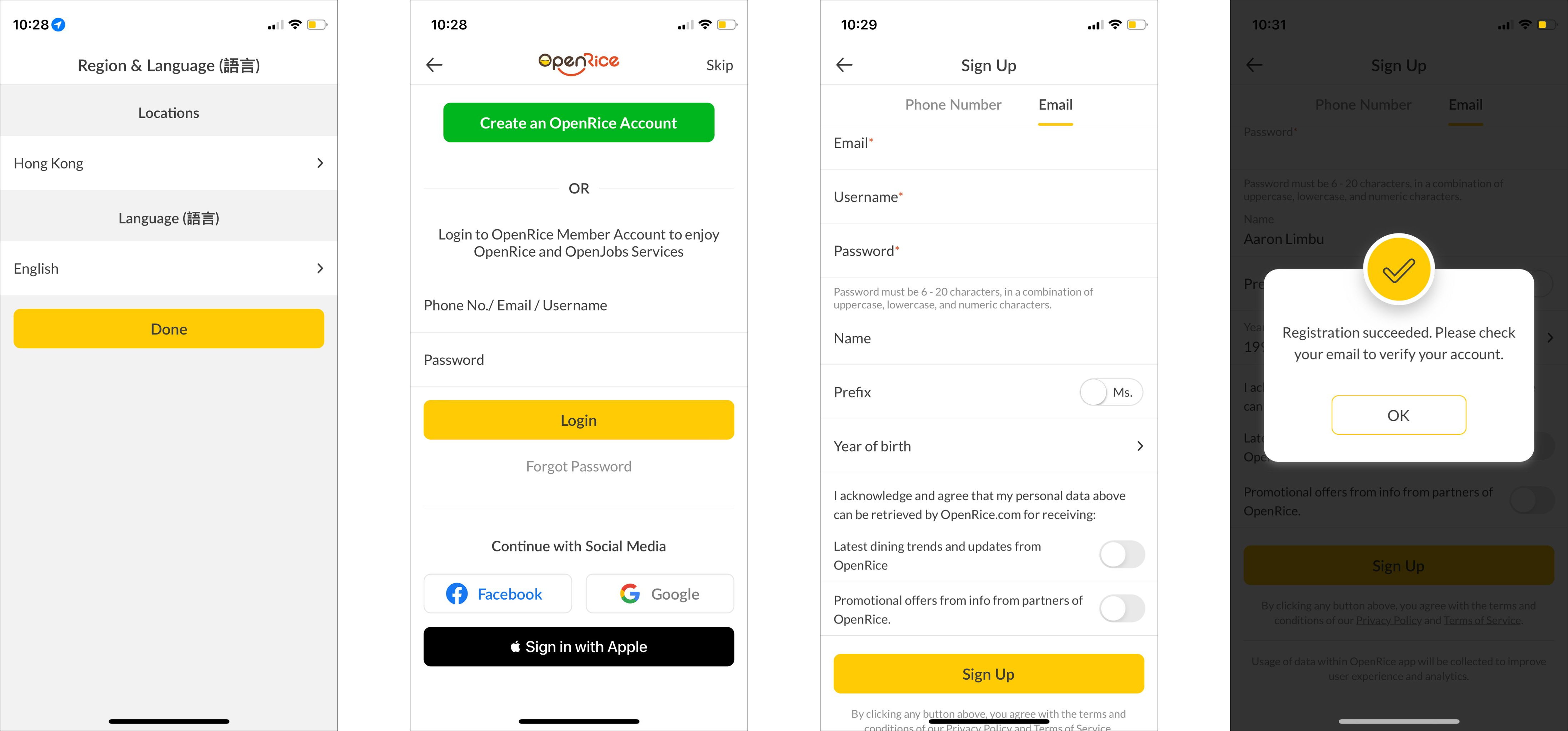
- Continue with social media" to log in is confusing: Questions that came up when looking at social "continue with social media":
(1) How does it really function?
(2) How can users "continue with social media" if they have not signed up using that medium?
- Helpful if the onboarding process reminds users why they want to use the OpenRice app
- Lacks in informing users what the app has to offer
- The "create an account" process is tedious, with several steps to complete
- Lacks progress indicators
- The signup and login page looks congested"
- Continue with social media" to log in is confusing: Questions that came up when looking at social "continue with social media":
(1) How does it really function?
(2) How can users "continue with social media" if they have not signed up using that medium?
App UI heuristics
- The layout looks too packed
- Too many texts are a potential distraction that could affect retention
- The layout looks too packed
- Too many texts are a potential distraction that could affect retention
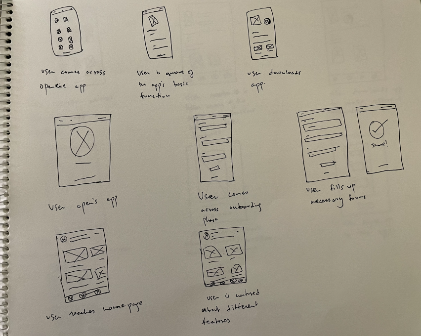
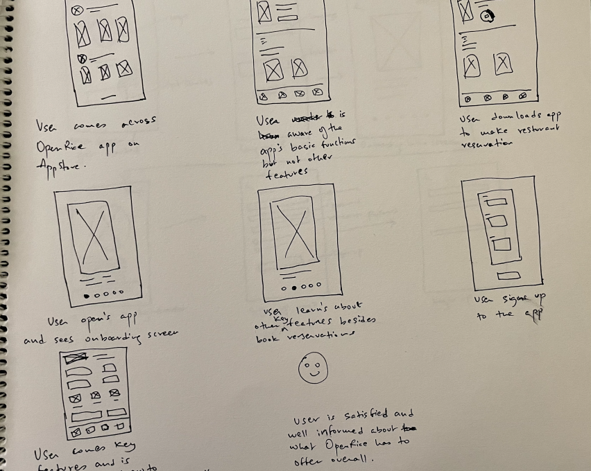
The problem
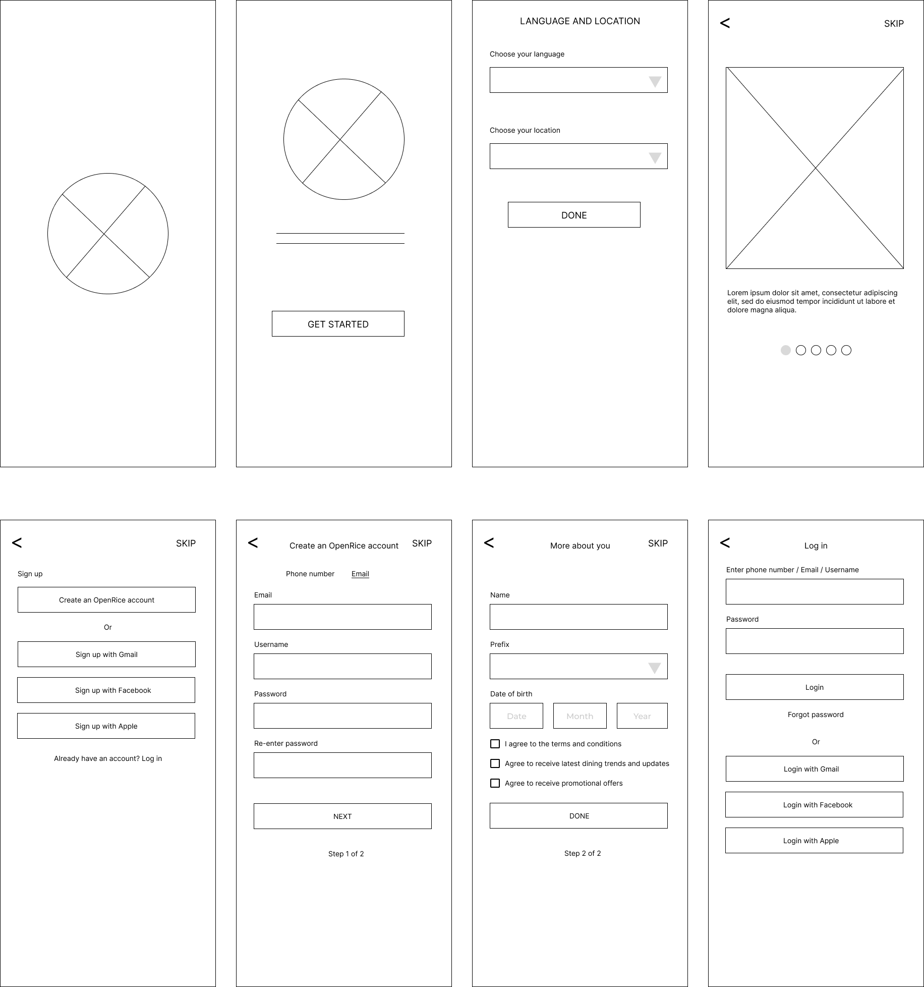
- How may I deliver an informative introduction to new users through designing before signup or login screens?
- How may I simplify the login and signup process?
The solution
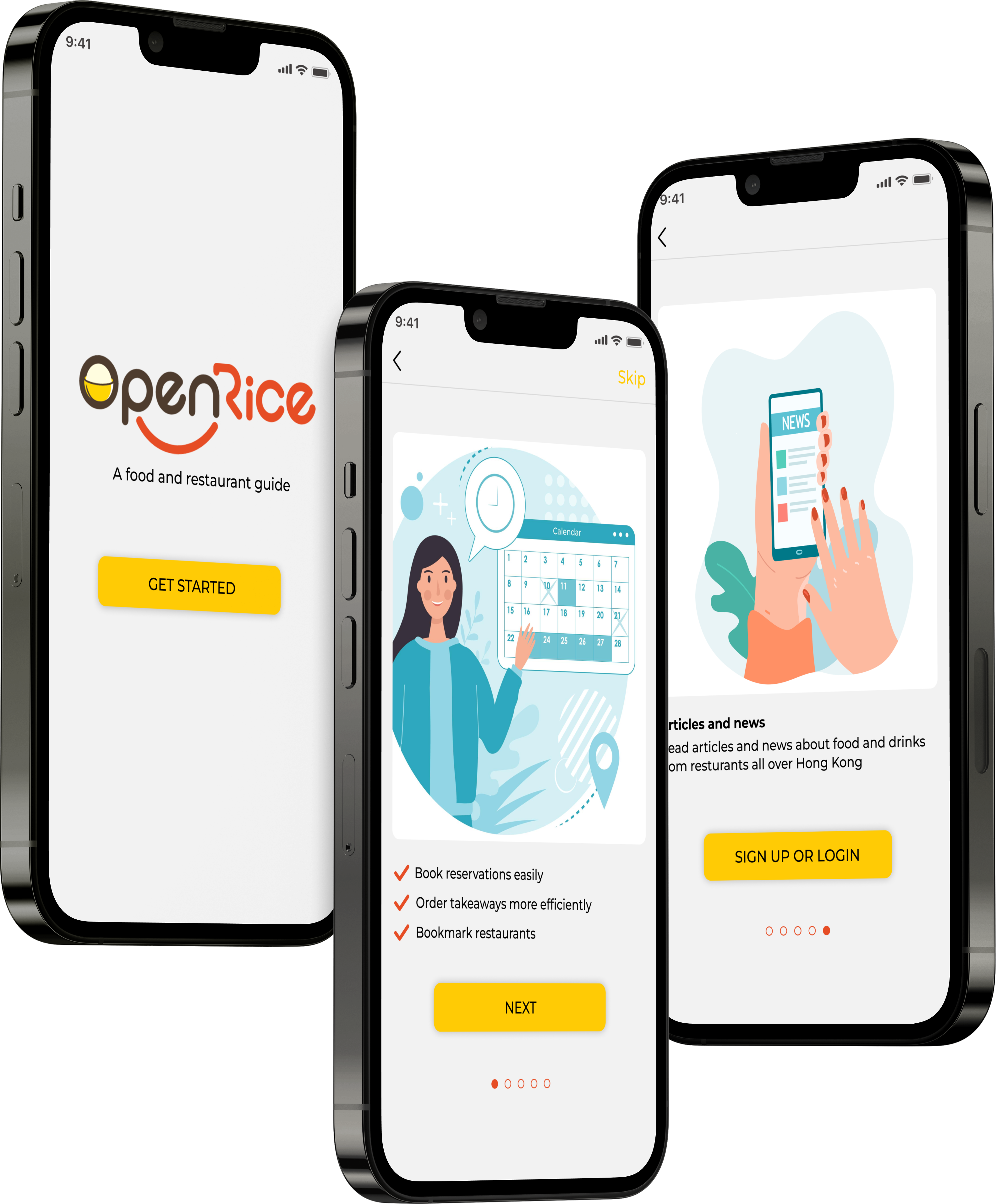
- To provide a more benefit-and-function-focused onboarding process for the OpenRice app.
- To provide a simplified user flow for the login and signup process with an option to skip signing up or log in during the onboarding phase and instead continue as guest. Users can choose to sign up or log in later from the home page.
Users
Needs
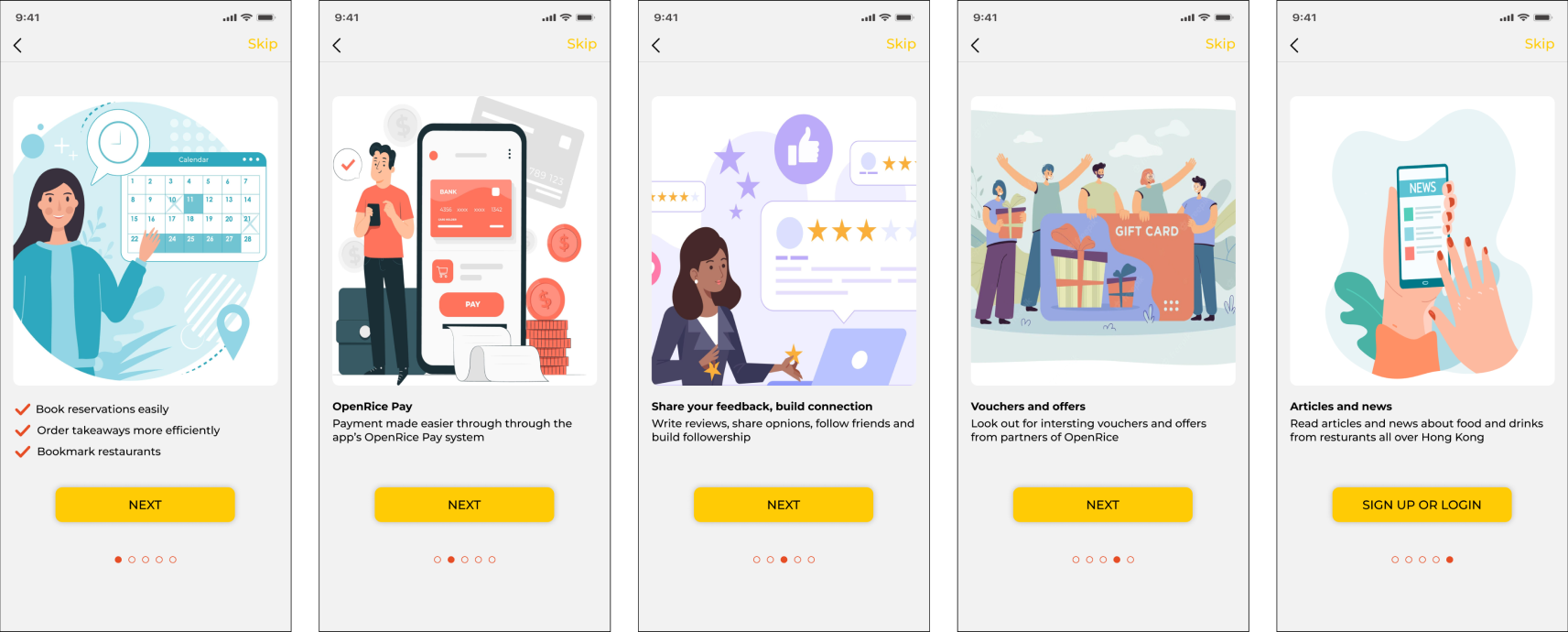
- Onboarding process to remind users why they want to use the OpenRice app
- Introduce core benefits of the app
- Explain core functions of the site
- Essential onboarding requirements to look at:
(1) Book reservations
(2) Reviews
(3) How to build a following & get followed
(4) Bookmark restaurants
(5) Use OpenRice payment
(6) Read articles
Pain point
- Not aware of other features available on OpenRice.
- Not aware of other features available on OpenRice.